Retail store design plays a critical role in how students and the community view your campus store. When the BYU Store Director Mark Clegg joined the store team, he knew he needed to lead the way in modernizing the store. His goal was to provide the campus community a school-branded immersive retail experience that would bring customers to the store time and again.
“We hope the remodel drives an entirely new experience that will help with the big three fundamental sales metrics of retail: recency, frequency, and monetary value (RFM). By delivering a new and exciting experience, we hope our customers will come more often, stay longer and spend more. The favorable impressions our customers leave our store with are far more likely to stick now,” Clegg said. “Because we are a destination store for customers off campus, it is critical for us to deliver on an experience that makes customers want to make the effort to come again.Taking into consideration the number of unique brick-and-mortar customers that we have, if we can influence them to come back just one more time during a 12-month period and spend what they normally do, it translates into a $6 million-dollar potential benefit for us. Most importantly, it positions the store for future growth and influence on the campus.”
Retail store design enhancements improve the student experience
Since 1906, the BYU store has served the campus and provided an invaluable resource for every new class of students. However, over the years, the store’s physical design fell behind retail trends and modern consumer expectations. Immediately seeing the store’s potential to elevate the student experience, Mr. Clegg set out to create a brand-new immersive retail experience.
“We have a rich heritage of supporting the campus community and our guests. Although the store has successfully operated for many decades, not much has been done to keep the store’s physical design modernized. I arrived in July of 2015 and found the store in a state of not only disrepair but lacking in appeal,” Clegg said. “The carpet was worn, the fixtures were old, the layout was all wrong and not much had been done to give the customer a more current experience. I also found the store to be lacking in what I call “immersive retail"— the ability to deliver both products and experiences that connect your guests to the brand.”
The BYU students and community would benefit from a campus store with a more modern design that reflected their interests and lifestyles. He developed a plan and worked to gain the necessary campus buy-in to complete his store vision.
“The BYU Store is located on three levels. The lower level is dedicated to religious products, framed art and clearance items. The upper level is textbooks, school supplies, the CougarTech store, gift wrap, customer service and online pickup. The main level houses all of our emblematic product, trade books, fashion, candy, accessories, a Nike section, and a convenience store. Over the past two and a half years, I have slowly funded small enhancements to both the lower and upper levels, but the main level, which draws nearly 10,000 people a day in foot traffic, was still very dated and unappealing,” Clegg said. “I developed a vision of what I believed would modernize the space and create a much more experiential shopping environment. Once I had the bones of that strategy in place, I presented it to the University CFO who I report to directly. I wanted to get a feel for his openness to some major changes. Thankfully, he responded very positively to the plans and after a number of months and presentations to various planning committees, I was able to secure approval to begin a large-scale total remodel to the main level of the store.
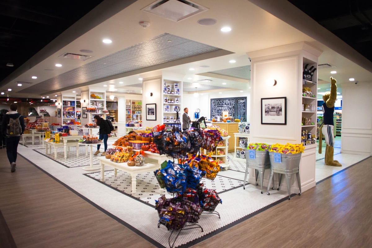
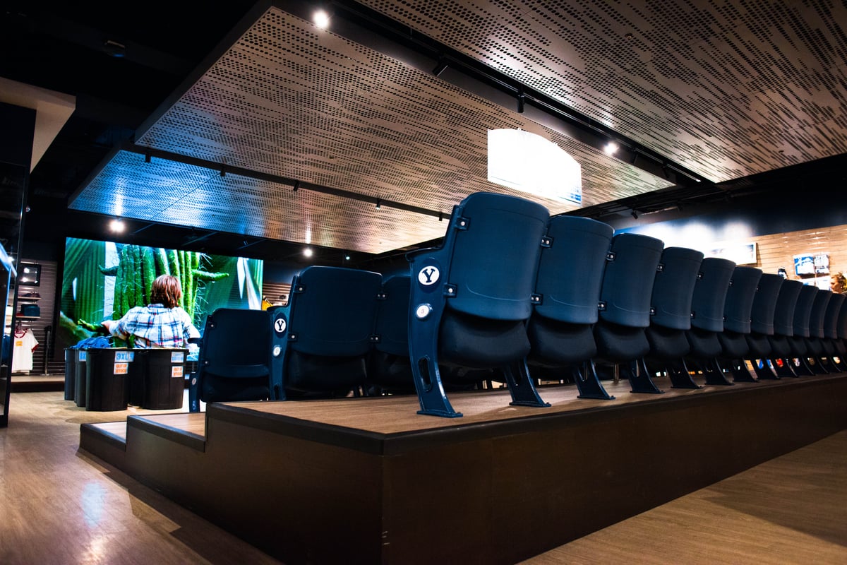
“This area is roughly 24,000 square feet. The remodel consisted of removing walls, removing the entire acoustical ceiling and grid, replacing flooring, new lights (both track and area), integrating a new sound system, installing a new security system and cameras, and creating “shopping zones” within the space that appeal to the key demographics of our target customers. By removing the ceiling grid and tiles, we gained an additional four feet of ceiling height. We also painted the ceiling black to make it disappear,” Clegg said. “Our new zones are the Sweet Stop Candy Shop, an Interactive Learning Center and a large 16 feet by 9 feet viewing screen with in-store stadium seating called the Fan Zone. We also have a new concept Milk & Cookie Bar which serves both regular and chocolate milk with over 24 flavors that can be added. You choose your cookie dough, and have it flashed-baked in 3 minutes. It is similar to a gelato bar. There’s nothing like hot cookies and milk.”
Immersive retail enhances the school brand
Strengthening the student experience and enhancing the school brand was an important consideration throughout the store’s redesign efforts. By creating unique customer experiences that evoke school pride, the store ensures each person leaves with a positive, memorable experience.
“I believe the mission and strategic focus of a campus store is to connect both the campus community and visitors with the brand. We have built into the new remodel a number of touch points,” Clegg said. “Fun displays engage customers and remind them of the BYU brand. Each new area of the store is appealing in and of itself, but woven together, they are designed to create an experience that entices the customer to wander and connect.”
These new store zones provide tailored customer experiences that change the way customers view on-campus retail. Students and the community can easily purchase anything they need while on campus — from convenience store items to books, games, fashion and logoed apparel, and technology. Shoppers can also peruse the store’s Nike Zone and legacy collection luxury items like a pool table, fine leather purses and limited-edition hats.
“The modernization of the space attracts students and is more in line with what they expect. The design process was influenced, in some degree, from student surveys about the student union building,” Clegg said. “Students felt the building and the store were very dated. Students were a strong consideration when the design teams met. We believe the store changes will help students connect with the brand of the Y.”
In addition to improving the student experience, the store also set out to enhance its community connection by including an Interactive Learning Center designed for families and to welcome guests of all ages to the store.
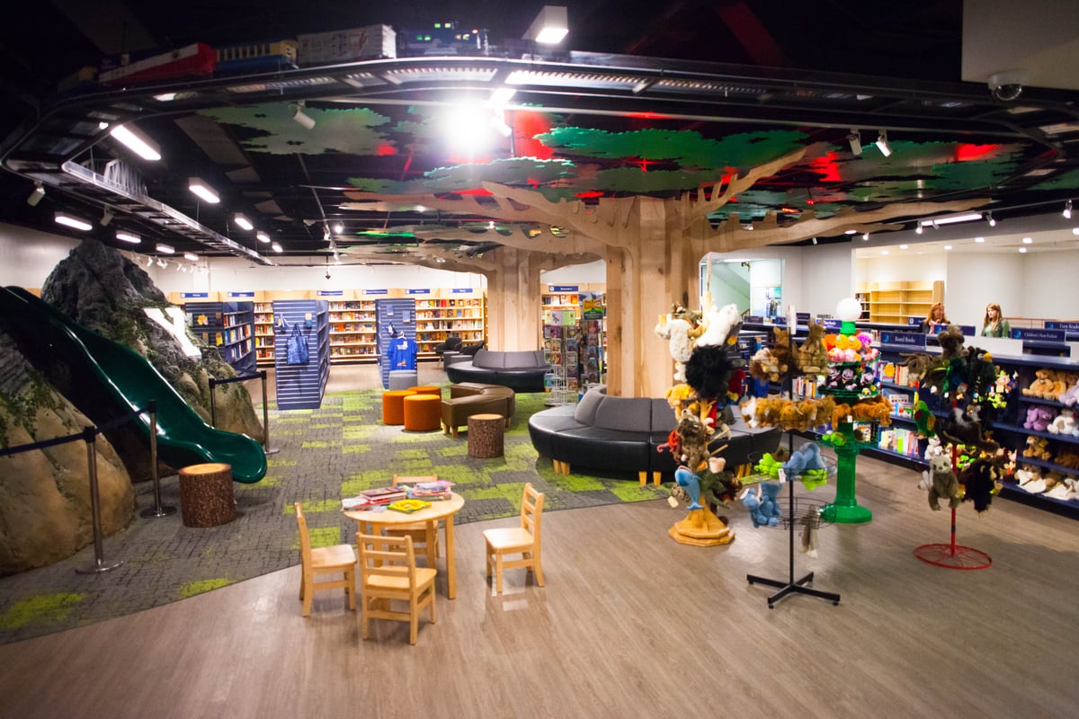
“The Interactive Learning Center is a collection of trade books, learning activities, puzzles, games, etc. It is a very family-focused area of the store. Adults, youth and children all have something to engage with here. The area boasts a slide down Y Mountain and a train track with an actual train circumventing the ceiling area that weaves in and out of the trees. The trees have comfy seating around the trunk, a fire pit seating arrangement at the base of the mountain and a Y that lights up on the mountain. It is designed to be a location that allows parents to let their children play while they shop. It has become a real draw for families,” Clegg said. “We also work to have an excellent selection of bargain and full-priced children’s books. As we all know, this is a retail vertical that is somewhat struggling. We will continue to look for ways to engage the mind and hearts of our customers both young and old.”
How does a large-scale remodel work in an operating store?
Updating a store while continuing to serve the campus community is a challenge. The BYU store went into the remodel with a precise plan that let them make store improvements and minimize disruption as much as possible.
“We created a five-phase construction model that divided the store into phases that took into consideration product movement. Operating a store while simultaneously constructing that space is, by far, the single biggest challenge,” Clegg said. “We moved products numerous times as we went through the fives phases of construction. Because the entire ceiling had to be removed during the phases, it meant removing all product from that area, putting up visqueen walls to protect the existing product from the paint that was applied to the ceiling. Not an easy thing to do. The store has looked less than ideal for a year now.”
Another challenge college stores face during a remodel is anticipating and planning for potential hurdles that could arise after construction is underway.
“Our second biggest challenge was lead times on critical equipment: lights, sound, tile, etc.,” Clegg said. “Coordinating the lead times and ensuring installers had adequate time to both get approval and then order the product in time to meet the deadlines was a big challenge.”
The BYU Store went into the remodel with a clear vision of its ultimate goal as a store. That defined mission helped focus all of its efforts on producing the desired outcome. Establishing that campus-focused mission gave the BYU Store a clear way define the store’s future success.
For college stores considering a remodeling project, Mr. Clegg offers advice.
“Measure twice, cut once. Start with your mission as the foundation. What is the store’s core purpose? In our case, is was to ‘Connect people to the spirit of the Y.’ Once we had that mission defined, it helped drive all the other aspects. Getting to what your store is really about and how it can make a meaningful contribution to the campus community is critical. Once that is defined, it’s all about executing on that mission. We kept asking ourselves, ‘Will this support the mission?’” Clegg said. “Of course, it has to make business sense, but sales, margins and financial performance are all derivatives of getting the strategy right. What are our unique advantages, who is our target audience and what can we do better than anyone else? Be willing to take risks. Be willing to fail. Be willing to be relentless and tenacious with your team.”
A college store branded for the future
Now that the remodel is complete, the BYU Store can give its entire community a uniquely appealing retail experience that takes shopping to the next level. Whether they are enjoying the milk and cookies bar, candy store or the Interactive Learning Center, every customer who walks through the doors will be transported into a one-of-a-kind adventure.
“Students love the self-serve candy section. This allows them to buy as little or as much as they like. They also love the full-service fudge counter,” Clegg said. “One of the unique things we are working on is a strong International Candy selection. BYU has students from over 100 countries and students that have served as missionaries in over 160 countries. So, having a fun international candy collection is part of our Sweet Stop experience. It truly is as good as just about any Candy Shop in the country.”
This attention to detail paired with a deep understanding of its core customer base allows the BYU Store to create an experience tailored for its customer’s preferences and lifestyle. By doing so, it creates an environment that is as inviting as it is functional for the people and campus it serves.
“Overall response has been very positive. Students represent a lot of our traffic, but not our dollars. Both students and off-campus visitors have been very positive about the changes,” Clegg said. “Creating compelling spaces throughout the store that pique customer interests and keeps them engaged in the store product and experiences will ultimately be our winning strategy. It’s hard enough to get people to cross the threshold and come into the store. Keeping people in the store longer is also a task. The experiential elements of this remodel are designed to accomplish both goals — interest them enough to come into the store and keep them engaged longer. Time will tell if we got it right, but for now, the feedback has been awesome.”


