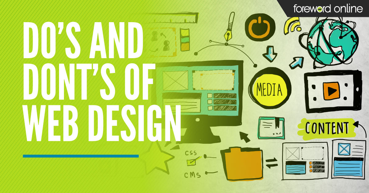
Last week, MBS held its annual Spring Forums event. System partners came together virtually to learn helpful system tips, hear store successes and access a multitude of resources. To kick off the week, the first session discussed how to strengthen college store eCommerce sites and what to avoid when working on your website redesign.
 Wayne Jones, Manager of Customer Education, led the session sharing statistics about the phenomenal increase in online sales in 2020 and how it could influence retail shopping going forward. While brick-and-mortar still has the largest portion of retail sales, eCommerce is quickly expanding. That’s why it is important to consider how you can offer online shoppers a more cohesive omnichannel experience with your store.
What to consider when building your site
1. Usability
One of the main influencing factors in how shoppers perceive your site is its usability. Customers expect to easily find what they are looking for, so your site should offer clear navigation, consistent flow and quick load times.
Navigation – Here are some tips to help streamline your site’s navigation.
- The top left of your site navigation should get the highest priority. Studies show that eyes move in an E, F or Z shape when scanning a page, meaning people typically start on the top left of the page. Therefore, it gets the most attention.
- Make it easy for customers to narrow down what they are looking for. Rather can creating a large grouping as a navigation tab (i.e., Merchandise) consider breaking it up into smaller categories that will help customers quickly find what they are looking for like Clothing, Gifts, Technology, etc. This will also help search engines better direct traffic to your site.
- Avoid cluttering your website navigation. Studies show that short-term memory can store seven objects (plus or minus two). Try to keep navigation limited to seven topics or less.
- Navigation should be discoverable. Discoverability is greatly reduced when navigation is hard to find or hidden, which can result in losing shoppers.
Consistency – Here are some tips to help improve your site’s consistency:
- The basic structure of your site should stay the same throughout each page. This will make it easy to learn how to navigate your site quickly.
- Be consistent with the colors you use throughout the site.
- Use consistent fonts, writing styles and graphics with most of your content.
Load times and homepage content – Here are some tips to improve your website load time and how to set up your site’s homepage.
- Keep your pages simple.
- Don’t add needless images or files to the page.
- Avoid videos on the homepage.
- Limit the items on your carousel and be mindful of the file size.
- Use navigation or limited banners to move to pages where more content is needed.
- Don’t sacrifice function for beauty.
2. Accessibility
Your website needs to be accessible for all shoppers. Make sure it meets current ADA requirements. Also, consider the different methods a customer might use to access your site: desktop, laptop, tablet or phone. A responsive web design ensures that no matter how a customer arrives, your site is scaled to fit the screen they are using.
Implement responsive web design
- MBS inSite is 100% responsive.
Keep site accessible for everyone
- Standard inSite processes are ADA compliant.
Design for all users
- Keep buttons descriptive.
Use logical layouts and images
- Provide transcripts for videos.
Keep images and text clear and crisp
- Check that zoom-in/out features work as intended.
3. Layout
Purposeful website layout helps improve navigation and makes it easy to highlight important information. It’s good to avoid site clutter and consider the hierarchy of the page (i.e., what displays above the fold — meaning what the viewer can see without scrolling) when redesigning your store website.
Bring attention to what’s important
- Keep navigation at the top, focus on the left for the most important points.
- Avoid clutter.
Focus the hierarchy of your site, so the most important information is above the fold
- Arrange the layout of your site to bring attention to what should be seen first.
- Always consider what customers will see before they need to scroll on the site.
- Guide viewers to your call to action. Navigation options and your call to action should be above the fold.
Keep in mind shopper familiarity
- Shoppers are used to standard structures for websites. By following industry standards, shoppers feel more comfortable, trusting and secure on your site.
4. Visuals
A great way to instantly connect with students and alumni shoppers is to avoid using stock images on your site. By sourcing your own pictures on campus, customers will instantly see places they recognize. This sets your store apart from large online retail competitors.
Utilizing photos
- Analyze the images you use. When the model is looking toward the camera, that image is likely to bring more attention to the photo rather than the page content. A picture where the model is looking toward the writing on the page will more naturally move the viewer’s eyes along the path you want them to take.
- Arrows can be used in the same way.
Stock images vs. unique photos
- Pictures with products or real people are ignored less than decorative images.
- Thumbnails that describe content are clicked on more than thumbnails that beautify the product.
Colors
- Color can emit an emotional response. Red can be seen as urgent or exciting whereas blue is dependable or creates trust and security.
- Color can help draw attention to an item and influence their feelings about the item.
5. Writing
Information shared on websites should be brief and easy to digest. Make sure you use a clear font, avoid jargon, and condense or break up long paragraphs. This will help visitors quickly find the information they are looking for on your site.
Keep text and links relevant
- Text can help you focus your site on the products, navigation and call to action.
- Too much text is distracting. Instead of long paragraphs, used condensed information and specific headings.
- Use visuals and navigation to bring users to important text-heavy pages like FAQ pages.
Size, scope and font
- Use text to describe your content.
- Use professional fonts.
- Keep social media blurb concise.
- Use size to bring attention to important details.
Simplicity
- Avoid jargon.
- Keep language to a less than 8th-grade reading level.
Watch the webinar to take an in-depth look at web design best practices that you can use to update your college store site and the tools and support MBS inSite provides to streamline the process.

