There comes a time when every campus store will eventually need to create a sign, a social media image or header, or a poster to market an in-store event or promotion to college students. However, some campus stores may not have access to a graphic designer. In those cases, you or someone on your staff, might have to design the piece yourself. A basic understanding of the elements of design helps you produce a better, more professional finished product that entices students into your store

Marketing to college students using the basic elements of design
When looking at the basic elements of design, it’s easy to get overwhelmed. A lot of careful thought and consideration goes into creating a visually appealing graphic that is eye-catching, easily understood and memorable. These basic design tips are meant to guide your design efforts to help you create a better end product.
Also, keep in mind that most colleges and universities have their own standard style guide. The guide should have your school’s official colors and approved fonts. Adhering to these guidelines will ensure your design piece fits into the overall school branding. If you do not have a style guide, ask your school’s marketing department.
Tip:
If you do not have access to Photoshop or inDesign, there are other free online design tools that can help create a great design, such as Canva, GIMP, Krita, etc. Or, you can easily use Microsoft PowerPoint by resizing the pages.
10 elements of design that will improve your campus store graphics
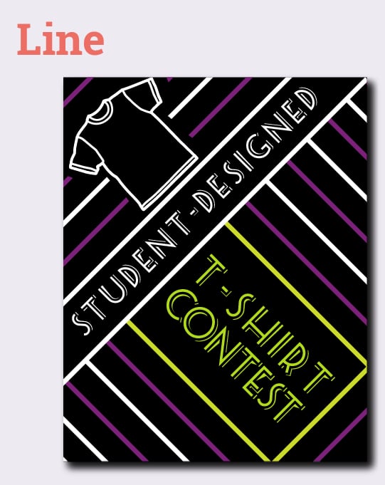
1. Line
A line is two connected points. In design, this can be used in a variety of ways. Line directs the viewer’s eye, it creates emphasis and it gives your piece a sense of movement. When you are working on your project, consider if you can easily use this element of design to draw a person’s eye to important information.
Tip:
Think about the gaps between elements that create lines. These are called invisible lines and can also be used to create emphasis, direct the viewer's eye and give a sense of movement.
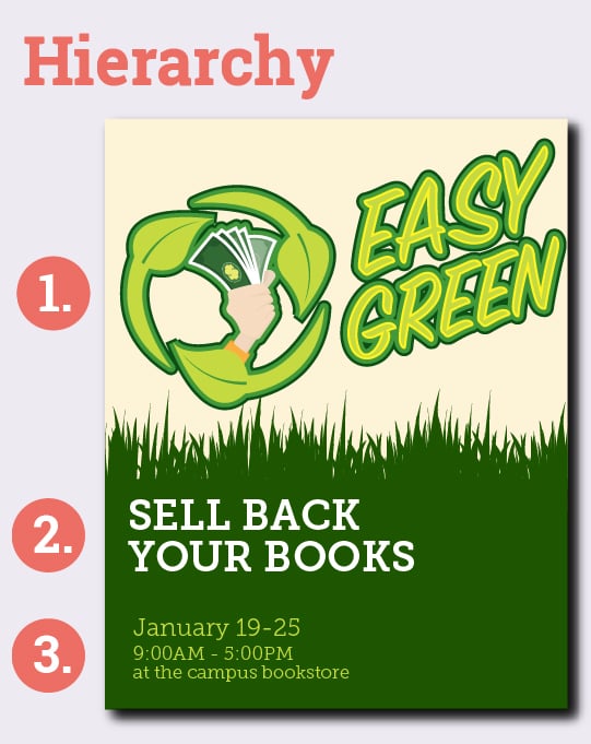
2. Hierarchy
Consider all the information you are sharing with your design. What is the most important part of that information? The answer to that question will become the top of your design hierarchy. Design these elements to command the most attention. This ensures the viewer takes away the most important information.
Tip:
Don’t use more than two or three fonts in a single design. Keeping things simple will help your work look more professional.
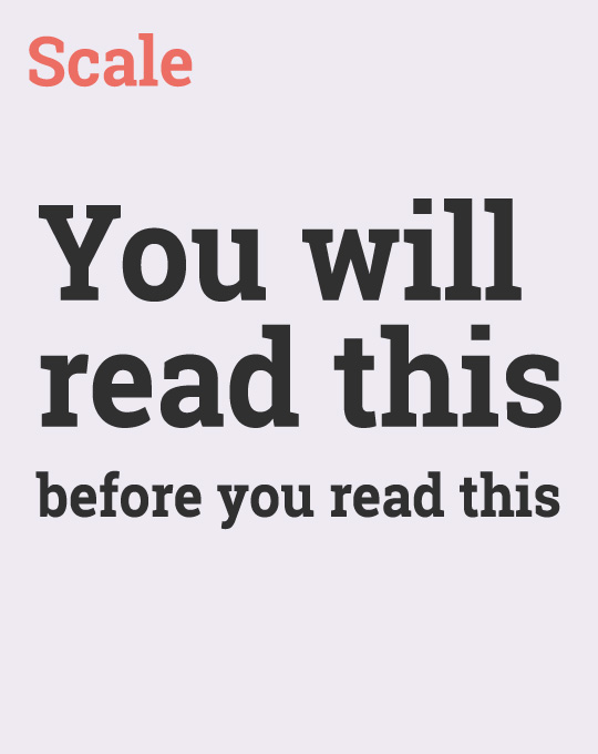
3. Scale
Experiment with the size of your design elements and type to add emphasis and draw attention to key information. Sometimes just subtle changes in scale can have a big impact. Other times, more dramatic changes will work best to get your message across.
Tip:
Consistently size similar text throughout your design. For example, a subheading would be smaller than a main heading, but all the subheadings in the design would be the same size.
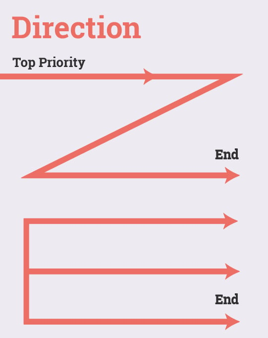
4. Direction
Direction shows the viewer how to read and process the information you are sharing. A study by the Nielsen Norman Group has demonstrated that the most common patterns of consumption — the way the eye moved across an image — are an E, F or Z shape. That means the top left part of the page naturally gets the most attention as the eye moves over the complete image in a “sweeping motion.”
Tip:
You do not have to design to these eye patterns, but as you create your design, it’s good to keep in mind how the eye will naturally move over the image.
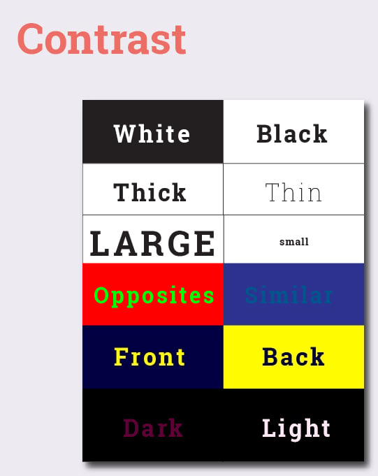
5. Contrast
Contrast enhances the degree of difference between two elements. It can be created using light and dark, thick and thin, and large and small elements. Utilizing contrast in your design can help make it eye-catching, but more importantly, easier to read.
Tip:
Use contrasting colors to add emphasis to your design.
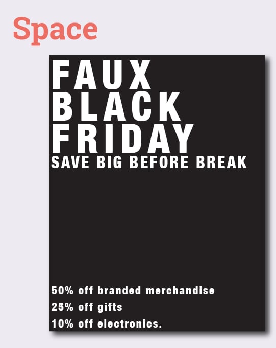
6. Space
Keep your design simple and powerful. Leave space so everything can be viewed and processed without overwhelming the viewer. Designing a project for students means they will probably see it in passing. Keeping your design clean, simple and easy to read will help them take in the information quickly.
Tip:
Space has a form, too. Consider the optical illusion art where the image could be a vase or a face. Negative space is as important as positive.
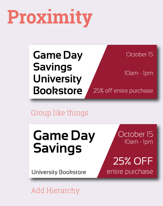
7. Proximity
Proximity is simply making sure related copy or design elements are placed together. Elements that have a close proximity to one another are connected in the mind of the viewers. Wider spaces separate elements.
Tip:
Group similar words and phrases together. For example, on a business card, you would group all the contact information together. Whereas, your name might have more separation for emphasis.
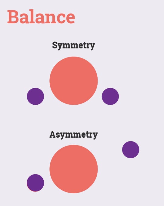
8. Balance
Balance can be symmetrical or asymmetrical. In your design you could use text, images, colors, sizes and shapes. Achieve a symmetrical balance by balancing the “weight” of each element from left to right and up and down. Asymmetrical balance is when you have unequal weight on either side of the design, but it still achieves a strategic visual balance.
Tip:
Be careful not to crowd a single side with visually heavy design elements like large patches of dark color or text that is too close to the edge.
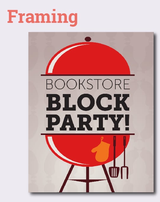
9. Framing
Look at the different ways you can use framing in your design. Framing is exactly what is sounds like. It’s a frame that goes around important information. It could be box outline around an important bit of text or it could be created with photographic elements that push your eye to where you want the viewer to look.
Tip:
Use framing sparingly. Do not put a box around everything. You can frame photos with text in a consistent way or utilize color to separate a section.
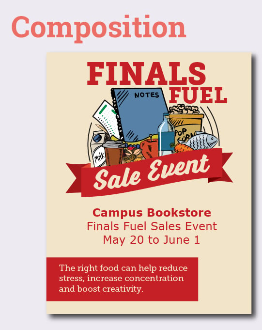
10. Composition
Composition is how you purposefully arrange the elements on the page. While working on the composition, consider impact of all the design elements you created. Play with your layout and arrangement to create a visually appealing or intriguing design.
Tip:
Draw out a loose sketch to work out your ideas before you begin (even professional designers have rough sketches). Minor planning will produce better results and save time.
You may not use all of these design elements in all your projects. However, by consciously incorporating and improving your understanding of some of these concepts, you can create better marketing materials for your campus store. Better graphics and materials will help you catch student attention both on campus and online and increase foot traffic in your campus store.